Pros and Cons of Samsung One UI for Android Pie
3 min read
The 2018 Samsung Developer Conference came with big announcements and new Samsung key features, and two of the major highlights are the upcoming foldable phone and the introduction of the new Samsung One UI for Android smartphone.
The new UI Samsung developed will start its beta testing for Samsung users later this month and expect to officially roll out in January 2019 on selected devices such as the Note 9 and Galaxy S9+.
One UI looks promising indeed and a bold move for Samsung, but it has its disadvantages as well. Here are the pros and cons of Samsung One UI for Android Pie.
The Good
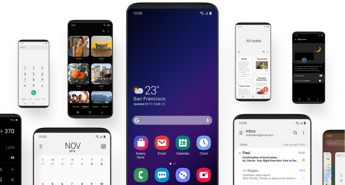
The new UI provides a cleaner interface making it look simpler and more user-convenient. This means the settings page is less cramped, clean-looking app icons, buttons that are easier to navigate and press, and a new “Focus Area” on the lock screen to help improve visual to important notifications.
The new interface also did the honor of organizing your apps. The screen will display two sections of the screen interface – The Interaction Area and Viewing Area. The Viewing Area takes up the upper half of the screen where all information is being displayed, while the Interaction Area is located on the other half where it houses all of the buttons and tabs you need to touch.
Samsung aims that the One UI to be pleasing to the users’ eyes any time of the day. If developers adapt the same, it would be a great alternative to easily resizing the UI to the lower portion of the screen.
Another sleek feature of the One UI is it allows the users to change the interface appearance based on the color of their phone. It also features a “Night Mode” that outfits a system-wide dark theme across the whole UI interface and elements, as well as Samsung apps.
The Bad
It’s not much, but it’s still worth mentioning.
While the split screen feature - Viewing Area and Interactive Area- looks promising, it is also a complete waste of screen space for other apps. For example, when using the notes and messaging app, the new UI forces all of the actual content down to the bottom half and the upper half only says “All Notes” or “All Messages”.
It’s a pretty waste of space since you can probably use half of the screen to view or browse more messages. It may look pretty at first, but we don’t need half of the screen to tell us that we’re currently viewing “All Messages”.
Moreover, Samsung is hoping to make life easier for users but it could result in the other way around. When using a Samsung phone, there are apps that already follow the new One UI standards and interface, but other apps are still using Google’s Material Theme. This is quite confusing when switching from different apps using different UIs.
Netizens also argued online that Samsung should’ve stuck with what Android Pie offers and stop changing the norm.
Final Thoughts
For now, we can't say for sure whether the new Samsung One UI brings good or bad. We know it’s still the beta version and obviously still has a lot of room for improvement. We just hope Samsung listens to its user-complaints and address the negative issues.
Newsletter
Get the latest tech news delivered to your inbox weekly.